Sora Gin
A Japanese-inspired gin identity expressed through day and night.
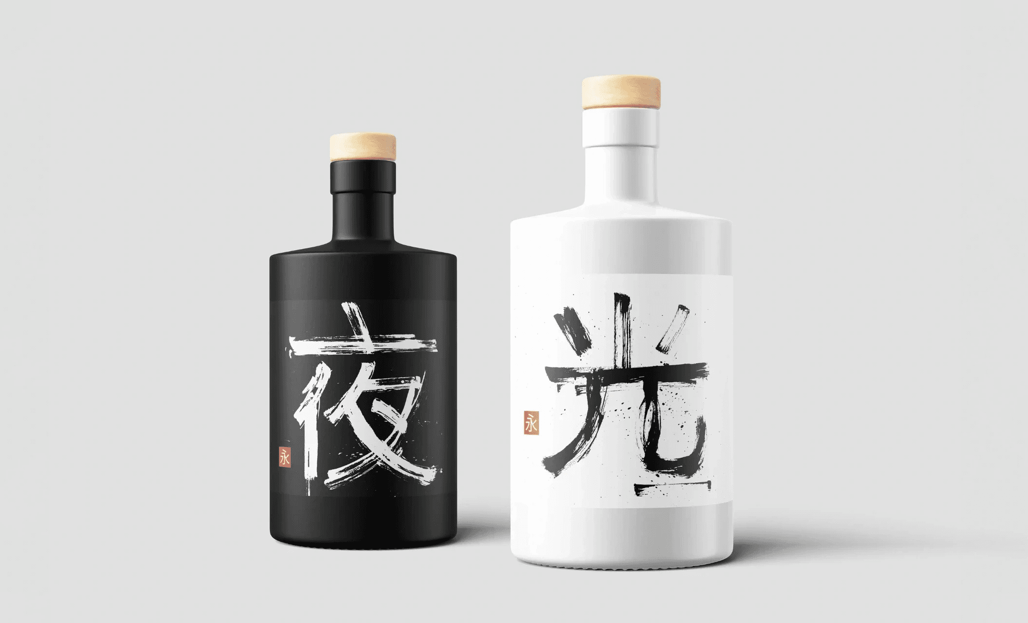
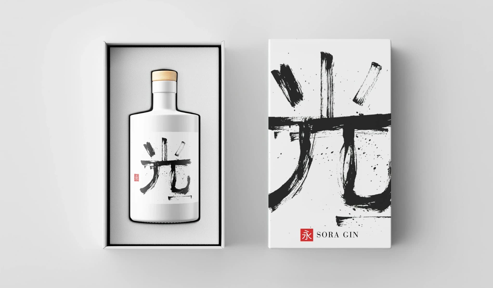
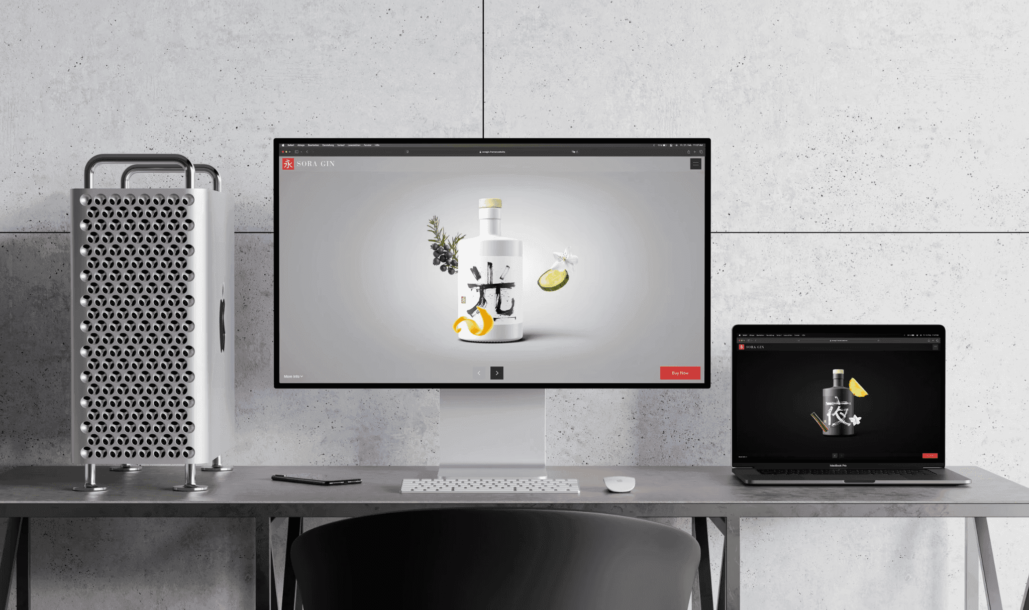
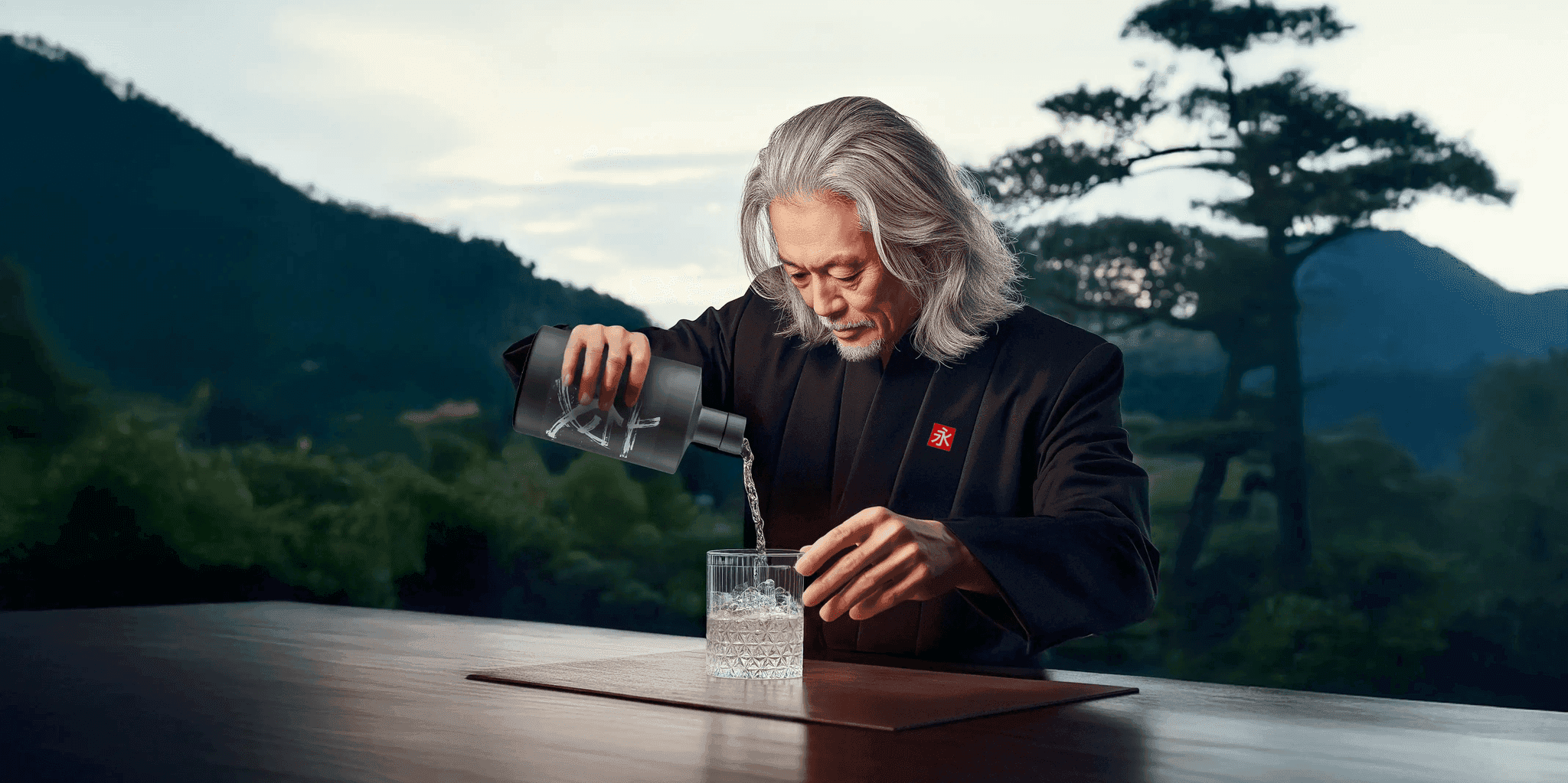
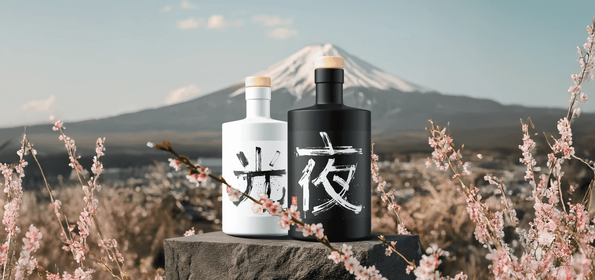
Sora is a Japanese-inspired gin brand with two complementary expressions: Eternal Day, presented in white, and Eternal Night, in black. I developed the identity across the logo, bottle design, packaging and website.
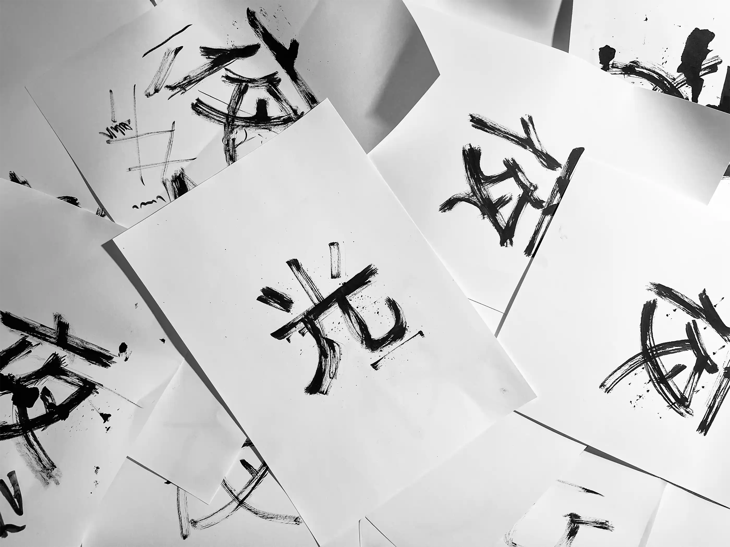
The visual system centres on a calligraphic character for eternity, combined with the characters for day and night. On the website, a continuous transition connects the two bottles and carries the same idea into the digital experience.